")
")


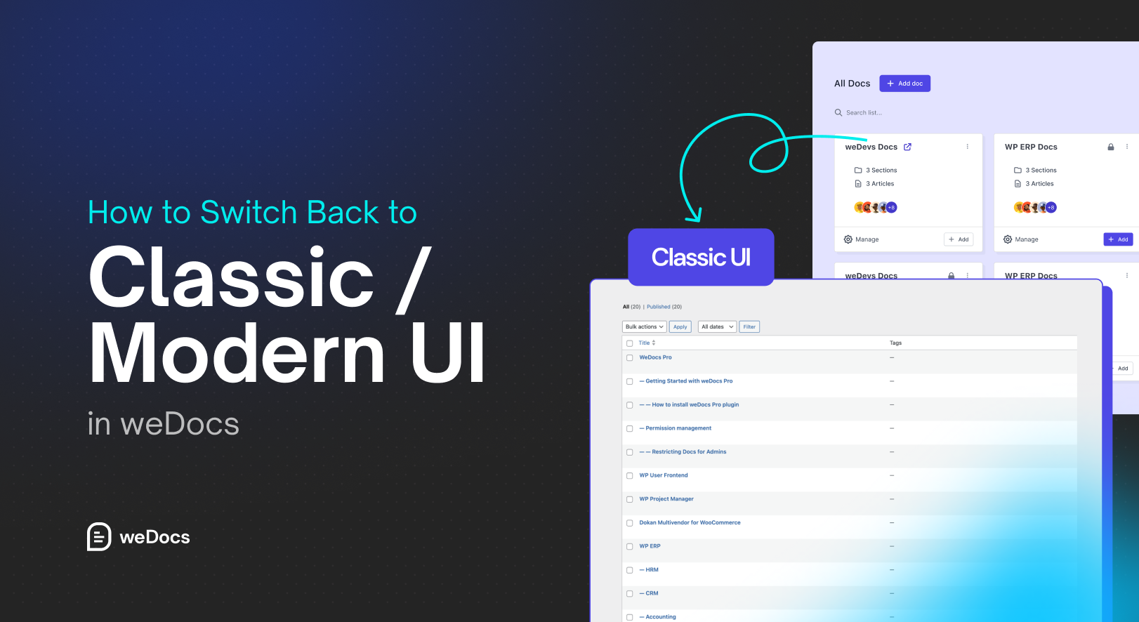
weDocs just got even better with two interface options, Classic UI and Modern UI.
Both layouts are designed to help you manage your documentation more efficiently, but each serves different needs.
The Modern UI offers a fresh, sleek design with improved navigation and readability. Meanwhile, the Classic UI keeps the familiar, minimal layout that many long-time users love.
In this guide, we’ll show you when to use each layout and how you can easily switch between them inside weDocs.
When You Should Use Classic UI and Modern UI
There are specific times when you should use the Classic UI and when you should use the Modern UI-
Classic UI
The Classic interface is ideal if you prefer a traditional documentation layout that’s simple and distraction-free.
Choose Classic UI when:
- You’re used to the old layout and want consistency.
- You’re working on documentation with multiple contributors who prefer the familiar design.
- You prioritize faster loading and minimal styling.
Best For: Teams that value simplicity and speed over design enhancements.
Modern UI
The Modern UI brings a refined look with improved typography, spacing, and overall user experience. It’s designed for readability and visual appeal.
Choose Modern UI when:
- You want your documentation to look more polished and professional.
- You’re focusing on user experience and accessibility.
- You want a layout that feels up to date and matches your site’s modern theme.
Best For: Businesses and creators who care about aesthetics and reader engagement.
How to Switch Back to Classic / Modern UI in weDocs
By default, when you install the weDocs plugin, you will see the Modern UI when you visit weDocs–> Docs.
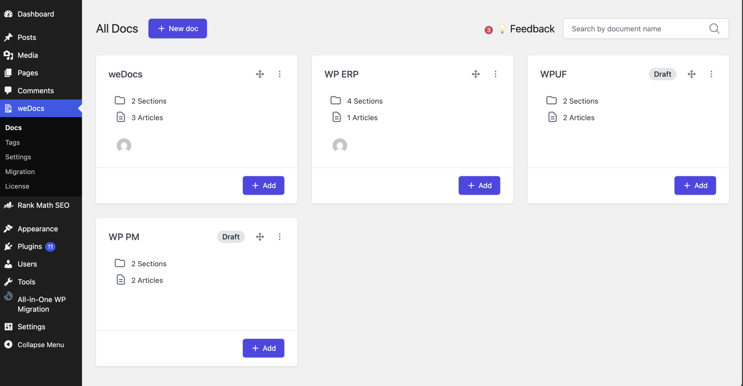
But if you want to switch back to the Classic UI, then scroll down to the bottom in the weDocs–> Docs section. At the bottom, you will see the Classi UI option. Click on it.
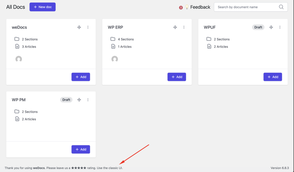
You will see the Classic UI screen for your documentation.
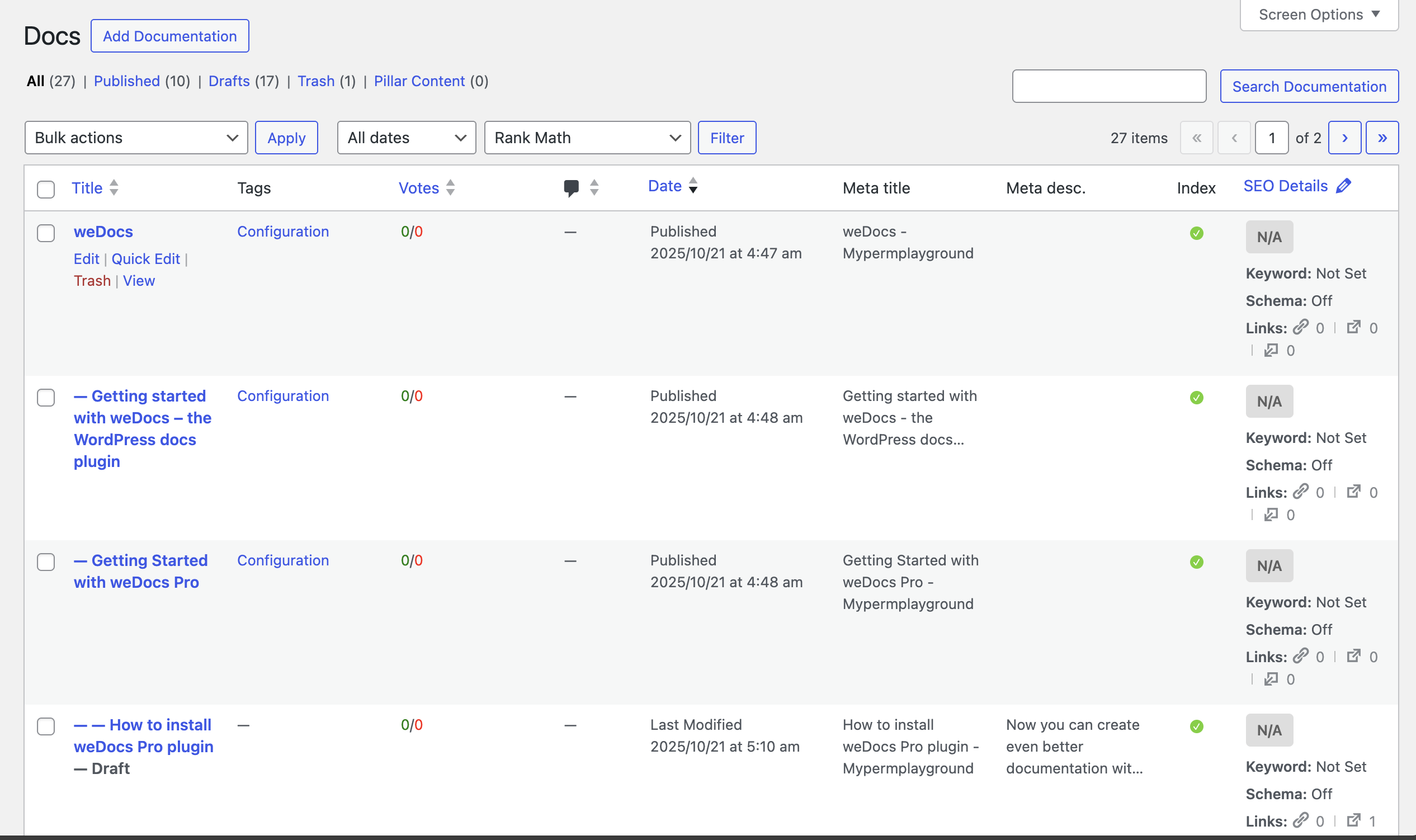
If you want to turn back, then just go to weDocs–> Docs, and you will see the Modern UI again.
That’s how easy it is.

Conclusion
Both the Classic and Modern UIs in weDocs are built to help you manage and present documentation your way. The Classic layout focuses on simplicity and familiarity, while the Modern UI gives your documentation a clean, professional look that’s easier to navigate.
The best part? You’re in control.
Switch between the two whenever you like, no content loss, no extra setup, just flexibility.
Try both and find the one that makes your documentation workflow smoother and more enjoyable.
Subscribe to
weDocs blog
We send weekly newsletters,
no spam for sure!