The holiday season brings a flood of customer questions. People want quick answers about shipping timelines, gift returns, order updates, and last-minute changes. A clean and welcoming knowledge base helps reduce this pressure. It also gives customers the confidence that they can find what they need without waiting for support.
A small seasonal refresh can make the experience even better. It feels warm, creates a friendly mood, and helps highlight time-sensitive information. It also shows that your brand is active and prepared for the busiest shopping weeks of the year.
Why Seasonal Design Matters
Holiday activity increases fast. Studies show customer support requests can rise by more than 65% during November and December, while over 40% of shoppers look for self-service answers before contacting support. A seasonal design helps guide these visitors to the right information at the right time.
It also creates a friendly experience during a stressful shopping period. Customers move quickly during the holidays, so a warm and welcoming layout helps them stay calm and find answers without frustration.
Seasonal design improves clarity too. Topics like shipping cutoffs, return windows, and gift-related issues become easier to spot when visually highlighted. This saves time for customers and lowers the load on your support team.
A fresh look also builds trust. When your knowledge base feels active and updated, customers believe they’re getting accurate and current information.
Holiday Design Tips You Should Implement This Holiday Season for Your Knowledge Base
The holiday season brings more visitors, more questions, and more urgency. People want quick answers about shipping, returns, order updates, and gift-related changes.
A warm and thoughtful design can make your knowledge base feel more welcoming during this busy time. It also helps customers find answers faster, which reduces pressure on your support team.
Here is what you should do-
- Give Your Knowledge Base a Warm Holiday Look
- Restructure for Holiday-Specific Queries
- Add Holiday Banners and Notices
- Add Festive Elements Inside Articles
- Improve Navigation During the Holiday Rush
- Highlight Essential Holiday Guides and FAQs
- Make Your Knowledge Base Mobile-First for the Holiday Rush
Tip 1: Give Your Knowledge Base a Warm Holiday Look
Holiday design has evolved a lot. Trends in 2025 and 2026 lean toward soft, minimal, and emotion-driven visuals instead of loud festive themes. Start with a calm color palette. Warm neutrals, muted reds, soft greens, and golden accents work well because they feel seasonal without looking outdated.
Micro-textures are also popular now. Adding a gentle pattern, such as soft snow grains or a blurred gradient behind your header, can create depth without slowing down the page. Many brands also use small festive icons for section headers or category thumbnails to build holiday personality subtly.
Avoid heavy graphics. Customers want a clean and fast experience, especially when they’re in a hurry. A modern holiday look should feel welcoming, not distracting. Soft highlights, rounded shapes, light shadows, and minimal icons offer the perfect seasonal touch.
Tip 2: Restructure for Holiday-Specific Queries
Holiday traffic looks very different from the rest of the year. Customers search for urgent, time-sensitive information, so the structure of your knowledge base needs a temporary refresh.
Start by creating clear seasonal categories. Popular ones include:
- Holiday Shipping Guide
- Order Cutoff Dates
- Gift Return & Exchange Policy
- Holiday Support Hours
- Tracking & Delay Updates
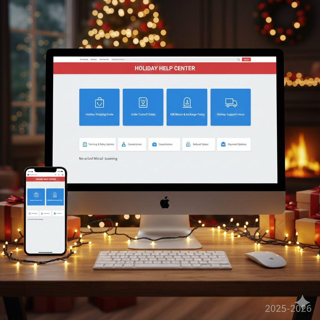
In 2025 and 2026, users prefer micro-categories instead of long, general ones. Smaller groups help them scan faster on both mobile and desktop. Break big topics into bite-sized documents so customers don’t need to scroll endlessly for answers.
Move these seasonal sections to the top of your knowledge base. Most users don’t scroll past the first screen, especially during busy shopping weeks. A temporary top-level category improves visibility and reduces repeated questions.
You can remove or reorganize these sections after the holiday rush, but keeping them easy to find during November and December will save your support team a lot of time.
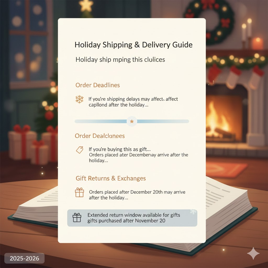
Tip 3: Add Holiday Banners and Notices
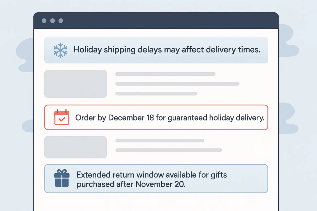
Customers want instant clarity during the holidays. Well-placed banners and notices help them understand changes without digging through multiple articles.
In 2025 and 2026, banners are cleaner, lighter, and more context-aware. Instead of loud graphics, use slim announcement bars that blend into your design. Keep the message short and action-focused. Examples include:
- “Holiday shipping delays may affect delivery times.”
- “Order by December 18 for guaranteed holiday delivery.”
- “Extended return window available for gifts purchased after November 20.”
Use dynamic or timed banners if your platform allows it. A banner that automatically updates after a cutoff date reduces manual work and prevents outdated information from showing.
Add a seasonal touch, but keep it subtle. A soft gradient, a tiny icon, or a winter color accent is enough. The goal is clarity, not decoration.
Place banners in two strategic locations:
- Top of your knowledge base homepage for general announcements.
- Inside high-volume articles like shipping, tracking, and returns.
This keeps customers informed and reduces unnecessary tickets during the peak season.
Tip 4: Add Festive Elements Inside Articles
Holiday design inside articles should feel warm, not overwhelming. Modern users prefer clean layouts with small seasonal details that make the content easier to read.
Start with subtle visual accents. Add small icons like stars, snowflakes, or ornaments at the start of important sections. Keep them minimal so the article still loads fast on mobile devices.
Use soft section dividers to break long content into smaller parts. A thin line with a gentle winter gradient or a tiny festive symbol in the center makes the article feel polished without being too decorative.
In 2025–2026, brands are using micro-illustrations instead of big banner graphics. These small, lightweight visuals help guide the reader’s eye and create a friendly mood. They also perform better on low-bandwidth connections.
Update examples inside the article to reflect holiday situations.
For example:
- “If you’re buying this as a gift…”
- “Orders placed after the 20th may arrive after the holiday…”
These scenario-based explanations make customers feel understood and speed up problem-solving.
Keep paragraphs short, give plenty of space between lines, and ensure your articles stay easy to skim. People are always in a hurry during the holiday season.
Tip 5: Improve Navigation During the Holiday Rush
Holiday visitors move fast. They skim more, scroll less, and expect instant clarity. Updating navigation for this season helps customers reach the right solution without confusion.
Start by placing the search bar at the top of your knowledge base homepage. Search behavior has grown stronger every year, and in 2025–2026, more than half of users rely on search first before browsing categories.
Clean up your sidebar or category list. Reduce clutter by hiding low-priority categories and placing holiday-specific ones at the top. This makes scanning easier, especially on mobile devices where space is limited.
Use short, action-based titles. For example:
- “Track Your Order”
- “Holiday Shipping Times”
- “Gift Returns”
These titles help customers instantly understand where to click, which reduces back-and-forth navigation.
Add breadcrumbs if they’re not already there. Customers often jump between topics during the holidays, and breadcrumbs help them move quickly without losing their place.
Finally, ensure important links are visible above the fold. Most holiday shoppers won’t scroll through a long page to find what they need.
Tip 6: Highlight Essential Holiday Guides and FAQs
Holiday traffic is unpredictable, and customers often look for the same set of answers. Highlighting your most important guides and FAQs helps them get those answers faster.
Start by identifying your high-volume topics. Common ones include shipping deadlines, delays, refund policies, and gift returns. Bring these articles to the very top of your knowledge base. Customers should see them the moment they land on your help page.
Create a Holiday Essentials section. This acts like a shortcut hub for your most important articles. Keep it simple with 5 to 7 guides so users don’t get overwhelmed.
FAQs are more important during this time because customers want fast answers. Update your FAQ section with new, holiday-specific questions such as:
- “Can I change the delivery address for a gift?”
- “What is the extended return period for holiday purchases?”
- “Will my order arrive before the holiday?”
Short answers work best. Customers skim, so each FAQ should be easy to read at a glance.
Add small visual cues like stars or winter icons to highlight these essential guides. They help customers spot the right information quickly, especially on mobile.
Tip 7: Make Your Knowledge Base Mobile-First for the Holiday Rush
Holiday traffic is now dominated by mobile users. In 2025 and 2026, more customers browse help articles from their phones while they shop, compare prices, or track orders on the go. A mobile-optimized knowledge base is no longer optional during the holiday season.
Start by checking how easily users can scroll, tap, and navigate on smaller screens. Make sure your category list is short and easy to scan. Long titles or crowded layouts slow users down, especially when they’re dealing with urgent issues like late deliveries.
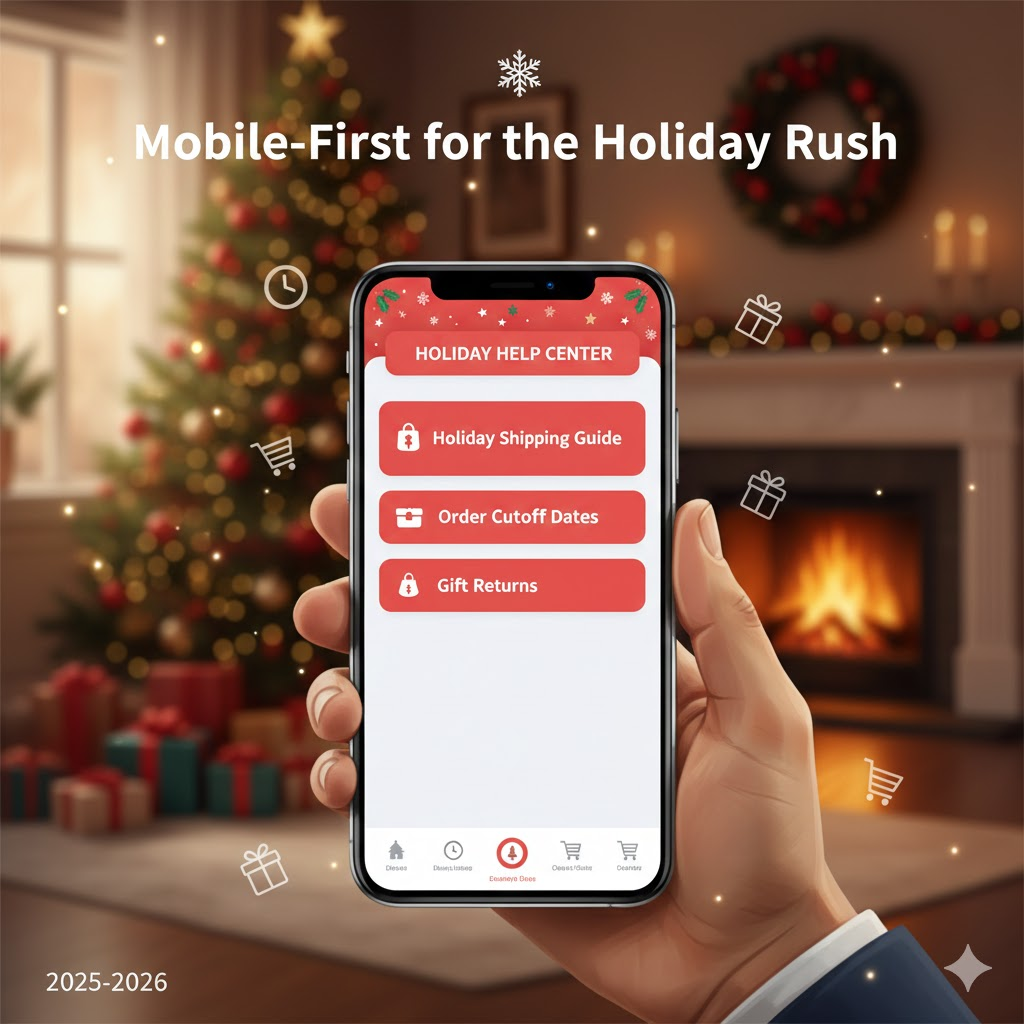
Keep paragraphs short. Modern readers skim, so each section should feel light and easy on the eyes. Add enough spacing between lines so the text doesn’t feel tight on mobile screens.
Ensure your search bar is visible without scrolling. Most mobile users rely on search first, so it should appear at the top whenever someone opens your help center.
Also test interactive elements. Buttons, toggles, and links should be large enough to tap comfortably. Avoid placing important links too close together because users may accidentally click the wrong one.
A smooth mobile experience saves time for customers and reduces frustration. During the holiday season, that can mean fewer tickets, faster resolutions, and a much more pleasant journey for shoppers.
How weDocs Helps You Design a Holiday-Friendly Knowledge Base
Once you’re ready to add a seasonal touch, weDocs gives you simple design options to make everything look warm and festive without changing your entire setup.
You get a clean layout to start with, and you can style each part in a way that feels modern and seasonal. These design-focused features help you shape the look you want:
Here are the design-focused features that actually matter:
- 7-Level Documentation Structure: The expanded hierarchy lets you create deep, organized content. This helps you style each level with small holiday icons, colors, or section accents without clutter.
- Shortcode-Based Embedding: You can place your docs inside any custom-designed holiday page, section, or layout—perfect if you want festive containers, banners, or patterned backgrounds.
- Clean, Minimal Layout: The interface is simple, making seasonal visuals like soft gradients, icons, or festive highlights feel natural and modern.
- Custom CSS Support: You can add holiday color accents, gentle borders, micro-animations, or small illustrations directly through CSS to match your seasonal branding.
- Responsive & Mobile-Friendly Design: All design changes—colors, icons, images—look good on phones and tablets. Important during the holidays when most support searches happen on mobile.
- Sidebar & Navigation You Can Restyle: Add festive icons next to category names, adjust hover colors, or apply subtle seasonal backgrounds to the navigation area.
- Article Layout That Supports Images & Visuals: You can insert small holiday illustrations, decorative dividers, or gift-themed icons inside articles without breaking the structure.
- Breadcrumbs You Can Theme: A small icon, a color shift, or a festive separator instantly makes navigation feel more seasonal.

These design options give you plenty of freedom to create a warm, holiday-friendly experience without overhauling your documentation system.
Be Ready To Tackle the Holiday Rush!
A holiday-ready knowledge base does more than look festive. It helps customers find answers faster, reduces pressure on your support team, and creates a friendly experience during the busiest shopping weeks of the year. Small design choices—like seasonal colors, clear sections, banners, and improved navigation—make a big difference when people are searching in a hurry.
Tools like weDocs make all of this easy. You can add seasonal styling, reorganize content, and keep everything clear and mobile-friendly without changing your entire setup. It gives you the flexibility to refresh your knowledge base and give it a warm, welcoming feel for the holiday season.
A few thoughtful updates now can help your customers enjoy a smoother, stress-free holiday shopping experience.
Subscribe to
weDocs blog
We send weekly newsletters,
no spam for sure!
