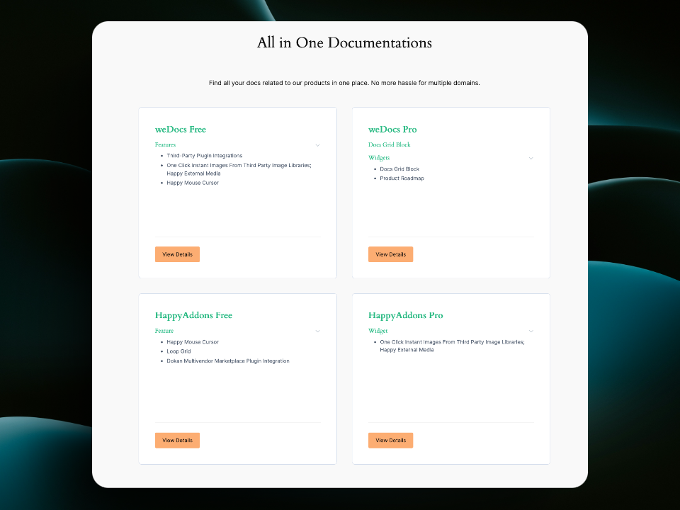
With the new Docs Grid Block in weDocs Free, you can easily create customized, visually appealing documentation grids on your WordPress site. Here’s a step-by-step guide to help you set it up:
Step 1: Make Sure You Have weDocs Free Installed
To use the Docs Grid Block, all you need is the Latest weDocs Free plugin installed and activated on your WordPress site. If you don’t have it yet:
- Go to Plugins > Add New in your WordPress dashboard.
- Search for “weDocs” and click Install Now, then Activate.
Step 2: Add a New Page or Edit an Existing Page
You’ll need to insert the Docs Grid Block on a page:
- Go to Pages > Add New to create a new page or go to Pages and select an existing page to edit.
- Name your page (e.g., “Documentation” or “Docs Library”) to give it context.
Step 3: Insert the Docs Grid Block
- Inside the page editor, click the + icon to add a new block.
- In the block search bar, type “Docs Grid” or scroll to find the weDocs – Docs Grid block.
- Click on the Docs Grid Block to add it to your page.
Step 4: Customize Your Documentation Grid
With the Docs Grid Block added, you can now personalize how your documentation is displayed:
Column Layout
- Choose Column Style: Select between single-column or double-column layouts to display your docs in the format you prefer.
Docs Display Options
- Docs Per Page: Set the number of docs to display per page. Choose from options like “Show All” or a specific number to create the look you need.
Exclusion Controls
- Exclude Specific Docs: Similarly, you can choose to exclude certain docs from the grid.
Sorting and Order
- Order By Options: Sort your docs by name, ID and weDocs Order.
- Order Type: Choose between ascending or descending order to further refine the display.
Sections and Articles Display
- Sections Per Doc: Define how many sections you want to display per doc (e.g., all sections or a set number).
- Articles Per Section: Control the number of articles displayed within each section.
View Details Button and Collapsed Articles
- Show/Hide the “View Details” Button: Decide if you want a “View Details” button to appear under each doc.
- Keep Articles Collapsed: Use the toggle to keep articles collapsed for a cleaner look, with the option to expand as needed.
Step 5: Style Your Docs Grid
Under the Grid Style Tab of the block settings, you can:
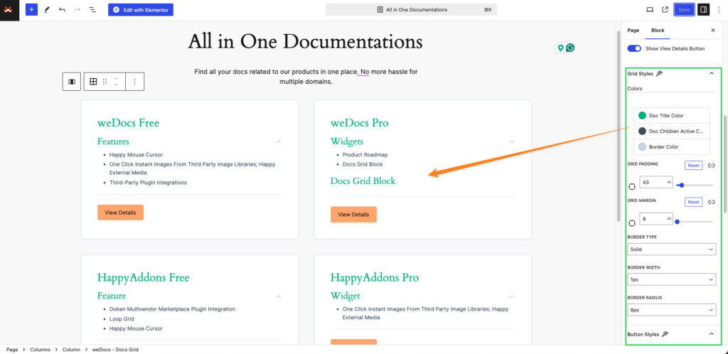
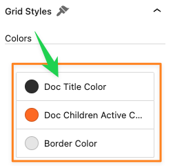
Title and Active Color Controls:
- Doc Title Color: Set a color for the document titles in the grid.
- Doc Children Active Color: Choose an active color for child items under each doc.
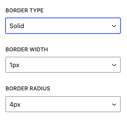
Border Controls:
- Border Type: Select the border style for grid items—options include solid, dashed, dotted, or none.
- Border Color: Set a custom color for the border around each grid item.
- Border Width: Adjust the border thickness to make it more or less prominent.
- Border Radius: Control the border-radius to achieve rounded corners if desired.
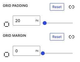
Grid Spacing and Alignment:
- Padding and Margin Controls: Adjust padding within each grid item and set the outer margin to control spacing between items.
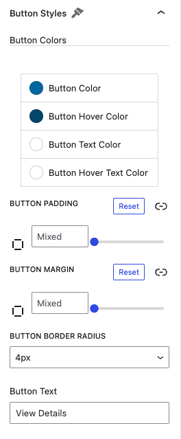
Button Style Options:
- Button Color: Set the background color for active buttons.
- Button Hover Color: Choose a color for the hover buttons.
- Button Text Color: Customize the font color.
- Button Hover Text Color: Set button hover text color.
- Button Text Field: Add your own button text.
Step 6: Publish Your Page
Once you’ve customized the Docs Grid Block to your liking:
- Click Publish or Update to save your changes.
- Visit your page to see your new docs grid in action!
Here is the overview:
