

If you have been using weDocs for a while, you already know what it does well. It gives you a clean, organized way to build documentation inside WordPress. Your users can find answers, browse articles, and navigate your knowledge base without leaving your site.
But there has always been one frustration that kept coming up. Your documentation looked like documentation. Not like your website. Not like your brand. Just a generic template that got the job done, but never quite felt like it belonged.
That is not a small thing. When someone lands on your docs, they are already in a moment of friction — they need help with something. The last thing you want is for the page to feel unfamiliar or disconnected from the product they are using. Consistency builds trust. Until now, weDocs has given you limited tools to achieve that consistency.
That changes with two simultaneous releases, “weDocs Free v2.2.1 and weDocs Pro v1.2.0”. Together, they bring Full Site Editing support, a set of new documentation blocks, significant AI improvements, an enhanced doc link opener, and a cleaner overall experience across both versions.
Let us go through everything.
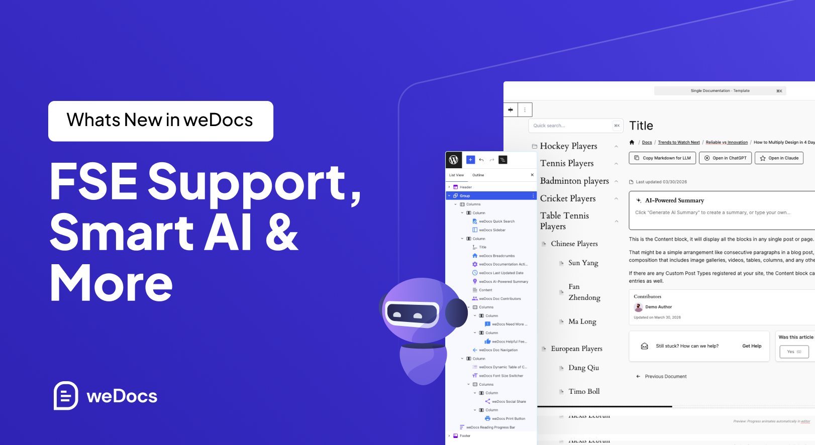
weDocs Free v2.2.1:- Full Site Editing Comes to Your Documentation
Full Site Editing, or FSE, is a WordPress capability that has been building momentum over the last few years. In simple terms, it gives you visual control over every part of your website, headers, footers, page templates, and archive layouts, using the same Gutenberg block editor you already use for posts and pages.
No PHP templates. No child themes. No custom CSS just to move a sidebar.
For most of WordPress, FSE has been available for a while now. But documentation plugins, including weDocs, largely stayed outside of it. Your single doc pages lived in their own template, separate from the block editing system, and your ability to customize them was limited.
With Free v2.2.1, that separation is gone. weDocs now integrates fully with the WordPress Full Site Editor. Your single doc page template is now editable using Gutenberg blocks, just like any other page on your site. You open it in the editor, you see the full layout, and you change whatever you want, visually, in real time, without writing a single line of code.
This sounds like a technical change, but the practical impact is significant. Here is what it actually unlocks.
Your Documentation Finally Matches Your Brand
This is the most immediate benefit and the one most people will notice first. When your docs use the same fonts, colors, spacing, and layout as the rest of your site, they stop feeling like a separate product and become a natural extension of your brand.
Think about it from your reader’s perspective. They are on your marketing site; everything looks polished and consistent, and then they click a help link and land on a page that looks completely different. That visual disconnect is a small thing, but it chips away at confidence. It makes your product feel less finished than it actually is.
FSE lets you close that gap entirely. Set your brand colors once in your theme, and your docs inherit them. Use your site’s typography, and your docs match. Build a layout that fits your design system, and every documentation page follows it automatically.
You Control the Layout, Not the Template
Before FSE, your single doc page had a layout and you worked within it. Navigation on the left, content in the middle, maybe a sidebar on the right — that was largely fixed. You could tweak things at the margins, but the overall structure was not yours to define.
Now it is. You can drag any block to any position. Want your table of contents at the top instead of the side? Move it. Want a full-width content area with no sidebar? Remove the sidebar. Want to add a callout block midway through the template that appears on every doc page? Add it once and it is everywhere.
This level of control matters especially for documentation that serves different types of users. A developer-facing API reference has different layout needs than a beginner-friendly onboarding guide. With FSE, you can create templates that serve each audience properly rather than forcing everyone into the same structure.
Rich Content Wherever It Makes Sense
One of the limitations of a fixed doc template is that you cannot easily inject elements at the template level. Things like promotional banners, feedback prompts, upgrade notices, or contextual CTAs all require workarounds — shortcodes, custom PHP, or plugin hacks.
With FSE, you add a block to the template and it appears on every doc page. Want a “Was this helpful?” prompt at the bottom of every article? Add a block. Want a banner at the top pointing users to your community forum? Add a block. Want a highlighted note about your Pro plan in the sidebar? Add a block. No code, no plugin conflicts, no developer required.
Faster to Update and Easier to Maintain
Visual editing means what you see in the editor is what your readers see on the page. There is no guessing, no refreshing to check, no surprise spacing issues that only appear on the live site. You make a change, you see the result immediately, and you save when you are happy with it.
For teams managing large documentation sites, this makes template maintenance significantly faster. Layout updates that previously required a developer can now be handled by anyone on the team who is comfortable with the WordPress editor.
Quick note on themes: FSE works best with block themes. If you are running a classic theme, weDocs still supports you — just enable legacy template support from weDocs → Settings → General. Full setup instructions are in the documentation.
Blocks to Design Your Documentation the Way You Want
FSE support is only as useful as the blocks available to build with. Free v2.2.1 ships with a set of new blocks designed specifically for documentation pages. Each one addresses a real friction point that readers encounter when using a knowledge base.
AI Summary Block
Long articles are a necessary part of thorough documentation. But not every reader needs to read every word of a long article. Sometimes they just need to know whether this is the right article before they invest the time.
The AI Summary block solves this by automatically generating a concise overview of your article and displaying it at the top of the page. Readers can scan the summary, decide if this is what they are looking for, and either read on or navigate elsewhere. It reduces frustration, improves navigation efficiency, and makes your documentation feel smarter and more reader-friendly without any extra work on your end.
Table of Contents Block
This one is straightforward but genuinely useful. The Table of Contents block auto-generates a linked list of headings from your article and displays it wherever you place it in the template. Readers can jump directly to the section they need instead of scrolling through content that is not relevant to them.
For longer articles, installation guides, configuration references, and troubleshooting docs, this is not a nice-to-have. It is the difference between a doc that feels easy to use and one that feels like a wall of text.
Doc Navigation Block
Previous and next article links, placed wherever you want them in the layout. This keeps readers moving through your documentation in a logical sequence rather than hitting the end of an article and bouncing back to the index to find what comes next.
Positioning matters here too. With FSE, you can place doc navigation at the top, the bottom, or both — depending on how your readers use your content. Long articles benefit from navigation at both ends. Shorter quick-reference articles might only need it at the bottom.
Reading Time Block
A small addition, but one that has a real effect on reader behavior. Showing an estimated reading time at the top of an article sets expectations. Readers know upfront whether they are looking at a two-minute quick fix or a fifteen-minute deep dive. That context helps them decide when to read, whether to bookmark for later, and how much attention to give the content right now.
Print and Social Share Buttons
These two serve different but equally practical purposes. The print button is particularly useful for documentation that people reference while doing hands-on work — setup guides, installation procedures, hardware configurations. Being able to print a clean version of the article without navigating away is a small convenience that gets used more than you might expect.
The social share button makes documentation shareable with a single click. For teams, this means someone who finds the answer they needed can immediately share it with a colleague. It turns your documentation into something that spreads organically rather than sitting passively waiting to be found.
weDocs Pro v1.2.0 :- Smarter AI and a Better Reading Experience
While the Free version focused on giving you design control, the Pro v1.2.0 release focused on making documentation creation faster and the reading experience smoother. Here is what is new.
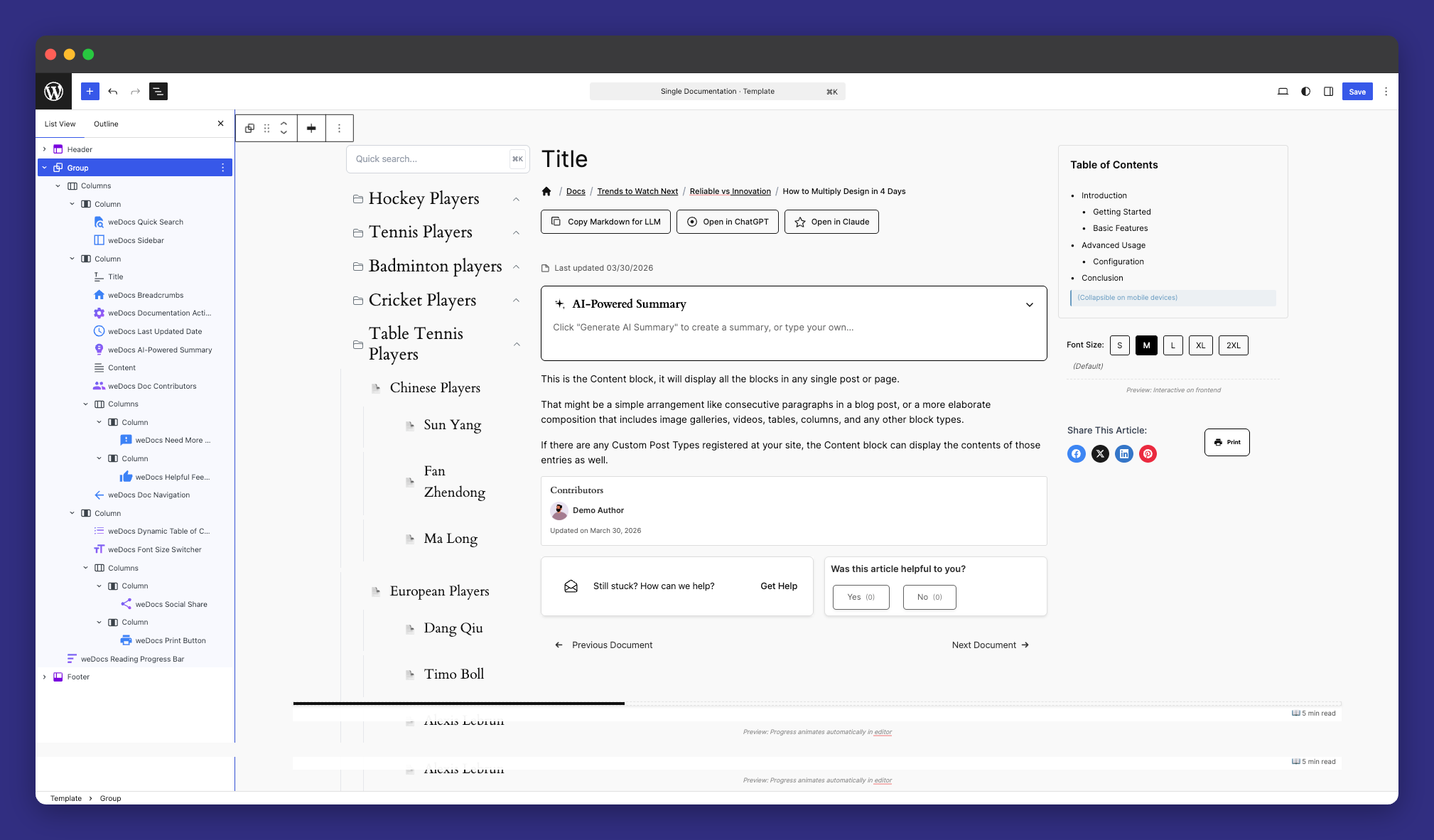
Image-to-Doc Generation
This is the feature that will save the most time for anyone who creates a lot of documentation. The idea is simple: you upload an image a screenshot of a UI, a workflow diagram, a whiteboard photo from a planning session and the weDocs AI writer analyses it and generates a structured documentation draft based on what it sees.
Think about how much documentation starts as a screenshot. A product update gets a screenshot. A new feature walkthrough gets screenshots. A bug report gets a screenshot. In most workflows, someone then has to sit down and manually describe what is in that screenshot in writing. That is slow, repetitive work that does not require much thought but takes a lot of time.
Image-to-doc generation handles that first draft for you. The output will not always be perfect and you will want to review and refine it, but getting from a blank page to a structured draft in seconds is a genuine workflow improvement. For teams shipping updates regularly, this alone can save hours every week.
Refreshed AI Chat Interface
The AI assistant widget that lives on your documentation site has been rebuilt in this release. The improvements are both visual and functional. The messaging flow is cleaner, the avatars have been updated, and the overall interaction feels more natural and less robotic.
Beyond the aesthetics, the underlying connection stability has been improved as well. The previous version occasionally had issues with AI connections dropping or becoming unreliable during longer sessions. That has been addressed, making the assistant more dependable for users who rely on it to find answers quickly.
Enhanced Doc Link Opener
When a documentation article links to another article, how that linked article opens has a bigger impact on the reading experience than most people realize. If every link pulls the reader away from what they were reading and onto a new page, the flow of the experience breaks constantly. Readers lose their place, lose context, and lose patience.
Pro v1.2.0 introduces three new ways for linked docs to open, giving you control over how that experience works for your readers.
Floating view opens the linked article in a small floating panel over the current page. The reader can glance at the linked content without leaving where they are, then close the panel and continue reading.
Side panel view slides the linked article in from the side of the screen. Useful when the linked content is substantial enough that the reader might want to spend more time with it, but you still do not want to navigate them away from the original page.
Modal view opens the linked article in a centered overlay. Clean, focused, and easy to dismiss when the reader is done.
These three options cover most use cases and give you the flexibility to choose the experience that fits your documentation structure best.
Mobile-Ready Navigation
The sidebar navigation now adjusts properly for mobile screens. For documentation sites with a significant mobile readership — and most sites do — this is a meaningful quality-of-life improvement that makes the browsing experience noticeably smoother on smaller devices.
Legacy Template Support
Pro v1.2.0 also brings legacy template support to the Pro version, giving you more flexibility to maintain your site’s existing look if you are running an older or classic theme setup. This removes a compatibility barrier that some Pro users were running into when trying to customize their documentation layout.
Fixes and Under the Hood Improvements
Both releases include fixes that improve day-to-day reliability. CSS scoping has been improved across the board to prevent style conflicts with third-party themes — a common source of visual bugs that could make your documentation look broken on certain setups. AI connection persistence has been strengthened in Pro, and a data processing error that affected certain configurations has been resolved.
For the complete list of changes across both versions, the full changelogs are available here — Free v2.2.1 changelog and Pro v1.2.0 changelog.
Now It is the Right Time to Update
For Free v2.2.1, update directly from your WordPress dashboard. Go to Plugins, find weDocs, and click Update. It is worth taking a backup before any major update, but the process itself is straightforward.
For Pro v1.2.0, the same applies, the update will be waiting in your plugins page once it is available on your license.
If you are not on Pro yet and have been considering it, this is a good moment to take a look. The AI features in particular have reached a point where they make a real difference in how fast you can create and maintain documentation. The image-to-doc generation alone is worth exploring if you regularly create documentation from screenshots or visual assets.
Subscribe to
weDocs blog
We send weekly newsletters,
no spam for sure!